Here’s why I think you should photograph vertically and some quick tips for successful upright image making.
Reason One: Verticals are Easy to Learn
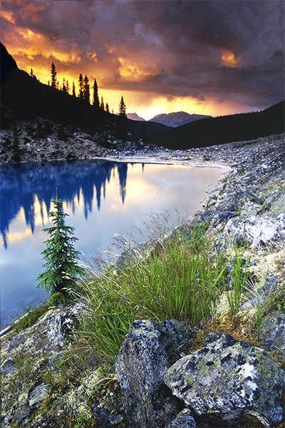
Vertical composition using a wide angle or ultra-wide lens is the fast track to making interesting landscape images. My first successful landscapes were all vertical compositions where I found a moderately photogenic foreground object and used this to lead into the greater scene. To this day I find it easier to frame up an interesting sunset in the vertical format. I use rocks, grasses, flowers – just about anything with form to introduce the viewer’s eye to the scene.
Moraine Lake, Alberta Canada (1997). Nikon F601, Nikkor 24mm, f/16, (shutter speed unknown), Fuji Velvia and most importantly, Lee 3 stop GND filter. This
was the first image that I ever made that actually turned out how I
thought it would! Note that foreground elements don’t have to be
spectacular to work, they just have to be well arranged in the frame and
complement the rest of the scene. When I was learning, I found it
easier to eliminate foreground distractions and make a ‘tight’
composition in the vertical format. As a result, I shot far too many
verticals in my early days and very few good horizontal images…
Reason Two: Vertical Compositions can be more Dynamic
In this dPS blog post, I explained the principles of ‘dynamic landscape compositions’. What I didn’t reveal in that article (for some inexplicable reason) was that vertical compositions can often accentuate the dynamic qualities of an image – particularly when using an ultra-wide lens.
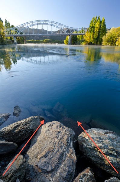
The Clutha River at Alexandra (it’s not wonky, the bridge slopes downhill…). Nikon D7000, Nikkor 12-24mm f/4 DX, Marumi Polarizer. 12 mm, f/11, 1/13th, ISO100. The
vertical format accentuated the leading lines present in the foreground
rocks. Getting low and tilting down on an ultra-wide lens distorts and
extends the perceived length of leading lines in the foreground.

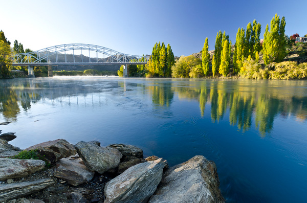
The Clutha River at Alexandra (the bridge still slopes downhill – I promise!). Nikon D7000, Nikkor 12-24mm f/4 DX, Marumi Polarizer. 12 mm, f/11, 1/13th, ISO100. When
shooting horizontally, the bridge and trees would not be in frame if we
used the same camera angles and proximity that were applied in the
vertical format. In this case I had to step back and recompose to
include everything, which reduced the dynamic impact of the rocks.
Reason Three: Verticals Sell Well
In the introduction I polluted the artistic sanctity of the article by mentioning ‘commercial reasons’. Five years ago we made most of our living from selling postcards of our images – horizontal postcards vastly outsell vertical postcards, and they fit better on a display stand, so I found myself inadvertently locked into a horizontal mindset (as I mentioned last week, deep thought and self-awareness are not my strong point). This sales trend is definitely mirrored in our website where the bulk of our print sales are horizontal.However, In the past year we have ramped up our stock photography activity and this is one area where vertical images sell extremely well – especially for editorial usage and magazine covers where the format works beautifully with the vertical layout of printed media. Consequently, we are shooting a lot more vertical images. You may not be a full-time photographer but there are myriad ways to earn money from your photographic hobby these days, don’t leave money on the table – shoot verticals along with your horizontal compositions.
Source: http://digital-photography-school.com/3-reasons-to-shoot-vertical-aspect-landscapes-and-6-tips-on-how-to-shoot-them/
No comments:
Post a Comment